How to Choose an Entryway Color Palette
Build an entry palette from one light base, one supporting neutral and one accent, starting with the floor, the door and the room you can see from the entrance.
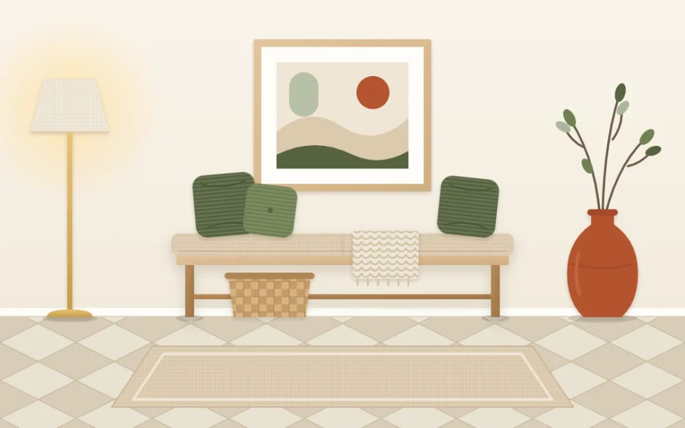
An entry often ends up decorated in leftovers: the rug that did not work in the bedroom, a lamp from an old apartment, a print in a frame that matches nothing. Each piece may be fine. Together they look unrelated, and that is nearly always a color problem, not a furniture problem.
A deliberate entryway color palette fixes this with very little effort, because the space is small and holds few things. You need three colors, a rough idea of how much of each to use, and one rule for where they come from. Here is how to choose them.
Three colors, in three amounts
Think of the palette as three roles instead of three favorite shades.
- A light base. The color of the walls and usually the largest surface in view. In most entries this is white, cream or a pale tint.
- A supporting neutral. The quieter mid-tone carried by the furniture, the rug ground and woven pieces: oak, sand, warm gray, natural fiber, black metal.
- One accent. A stronger color used in small doses on a few objects.
A familiar proportion for these is 60-30-10: most of what you see in the base, about half as much in the neutral, and a small remainder in the accent. Treat it as a loose guide, not a law. Its real use is as a check. If the entry feels busy, the accent has usually grown past its share; if it feels flat, the accent is missing or too timid.
Start from what you cannot change
Entryway colors are rarely chosen on a blank canvas. Before you look at a single paint chip or cushion, list what is already fixed:
- The floor. Wood, tile or stone already has a color and it covers a large area. Decide whether it leans warm, like honey oak or terracotta tile, or cool, like gray stone.
- The door and trim. The inside face of the front door is the biggest object in the space. If it is staying as it is, it has already claimed a place in the palette.
- The room you see next. Stand at the door and look through. The sofa, the wall color or the rug in that view will sit beside your entry every time someone walks in.
Usually the floor supplies the supporting neutral and the next room suggests the accent. That leaves you one real decision, the base, and far fewer ways to go wrong.
Check the undertone in the light you actually have
Many entries get little daylight. Some have a small pane beside the door; plenty have none. In low light, colors lose their liveliness: cool whites can turn flat and bluish, and deep shades read darker than they did on the sample.
This is why a warm neutral entryway is such a dependable choice. Cream, oat and soft sand keep some glow under lamp light and sit comfortably beside wood. Cool bases can look crisp and calm too, but they generally need more light to do it.
To test an undertone, hold the sample against the floor and the door, at the time of day you most often come home. If the sample suddenly looks pink, green or dingy next to them, the undertones are clashing. On a color wheel, warm colors gather around red, orange and yellow, and cool ones around blue and green. Keeping your base and neutral on the same side is the simplest way to keep the peace.
Borrow a color from the next room
The entry is an introduction, and an introduction works best when it hints at what follows. Pick one color that already appears in the room beyond, such as the green of a sofa, the rust in a rug or the blue of a painted cabinet, and make it your entryway accent color.
It does not need to be an exact match. A shade lighter or deeper looks more relaxed than a perfect copy. What matters is that someone standing at the door sees the color twice: once close by and once in the distance. That repetition is what turns a front hall color scheme into part of the home instead of a separate theme.
Three palettes to try
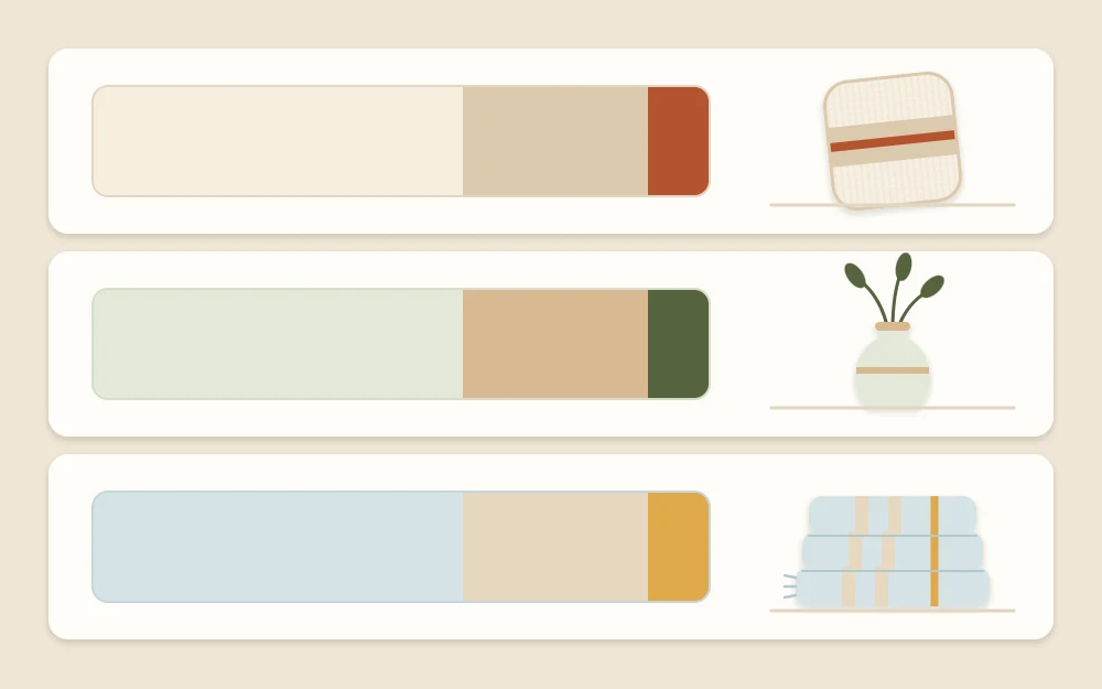
These combinations show how the three roles work together. Swap in what your floor and next room give you.
| Base | Supporting neutral | Accent | Suits |
|---|---|---|---|
| Cream | Sand and pale oak | Olive green | Dim entries with warm wood floors |
| Soft white | Warm gray and black metal | Terracotta | Entries with gray tile or a dark door |
| Pale sage | Natural rattan and oat linen | Honey yellow | Entries with some daylight and light floors |
Add color without painting the walls
If the walls are staying white, the palette simply moves onto objects. These carry color well in a small entry:
- The rug. It is the largest colored surface after the walls, so it can hold both the neutral and the accent in one pattern. The guide to entryway rugs and runners covers size and shape.
- Art. One print with your accent in it ties the wall to the floor.
- A lamp base or vase. A single ceramic piece in the accent is often all a console needs.
- Cushions. On a bench, two cushions can show the neutral and the accent side by side.
- The inside of the door. Painting it in the accent gives a strong block of color in one move. In a rental, check your lease or ask before making changes.
Tip
Repeat the accent three times at different heights, for example in the rug, on the console and in the art. Three appearances look intentional; one looks like an accident.
Keep the palette steady through the year
Once the three roles are set, write them down or keep a photo of the samples on your phone, and check anything new against them before it comes home. This is the step that stops the entry from sliding back into leftovers.
The base and the neutral should stay put. The accent is the part you can play with: a deeper version in winter, a fresher one in spring, carried by stems, a cushion cover or a small bowl. The approach to seasonal entryway decor builds on exactly this. And if you have not yet decided what furniture the colors will sit on, go back to the order of work in these entryway decorating ideas.
Frequently asked questions
How many colors should an entryway have?
Three is a comfortable number for a small space: a light base on the walls, a supporting neutral in the furniture and rug, and one accent on a few objects. Wood tones and woven fibers count as part of the neutral. A tiny second accent can work, but more than that usually makes a small entry feel busy.
Should the entryway match the living room?
It should relate to it without copying it. Repeating one color from the room you can see from the door, in a slightly lighter or deeper shade, is enough to connect the two. The entry can then have its own character while still reading as the beginning of the same home.
What colors work in an entryway with no window?
Warm, light bases such as cream, oat or soft sand tend to hold up best, because they keep some glow under lamp light. Cool whites can look flat in dim spaces. Pair the base with a pale rug and a warm lamp, and keep the accent to small objects so it does not darken the space.